How Lead Exposure in Children Can be Fixed, with Robbie Barbero
Criminal Justice
How Lead Exposure in Children Can be Fixed, with Robbie Barbero
Fighting Crime: Field Notes
Little Scandinavia - An American Prison Experiment
Criminal Justice
Little Scandinavia — An American Prison Experiment
Fighting Crime
Fixing Broken Prisons, with Mike Thompson
Criminal Justice
Fixing Broken Prisons, with Mike Thompson
Fighting Crime: Field Notes
Why Don't People Leaving Prison Get Jobs?
Criminal Justice
Why Don’t People Leaving Prison Get Jobs?
Fighting Crime
This Graduation Season, We Should Celebrate – And Ask Who We’re Leaving Behind
Career Pathways

This Graduation Season, We Should Celebrate – And Ask Who We’re Leaving Behind
Uniquely Designed Study Quantifies the Degree to Which Higher Payments are Driving Medical Services to Hospital-Owned Locations
Same Service, Same Price

Uniquely Designed Study Quantifies the Degree to Which Higher Payments are Driving Medical Services to Hospital-Owned Locations
Principles for Successful Work Requirement Implementation
Medicaid

Principles for Successful Work Requirement Implementation
How Do School Cell Phone Policies Affect Student Outcomes?
Evidence & Evaluation

How Do School Cell Phone Policies Affect Student Outcomes?
Generating Actionable Evidence for Policy and Practice: 2025 Research Funding
Evidence & Evaluation
Generating Actionable Evidence for Policy and Practice: 2025 Research Funding
A Year of Bridging Criminal Justice Research and Practice
Criminal Justice
A Year of Bridging Criminal Justice Research and Practice
Our 2024 Approach to Giving

Our 2024 Approach to Giving
Helping States Navigate OBBBA
Medicaid

Helping States Navigate OBBBA
The Work Opportunity Tax Credit Does Not Work to Increase Opportunity
Responsible Tax Reform
The Work Opportunity Tax Credit Does Not Work to Increase Opportunity
Ohio Students SAIL to Success in Lorain County
Higher Education
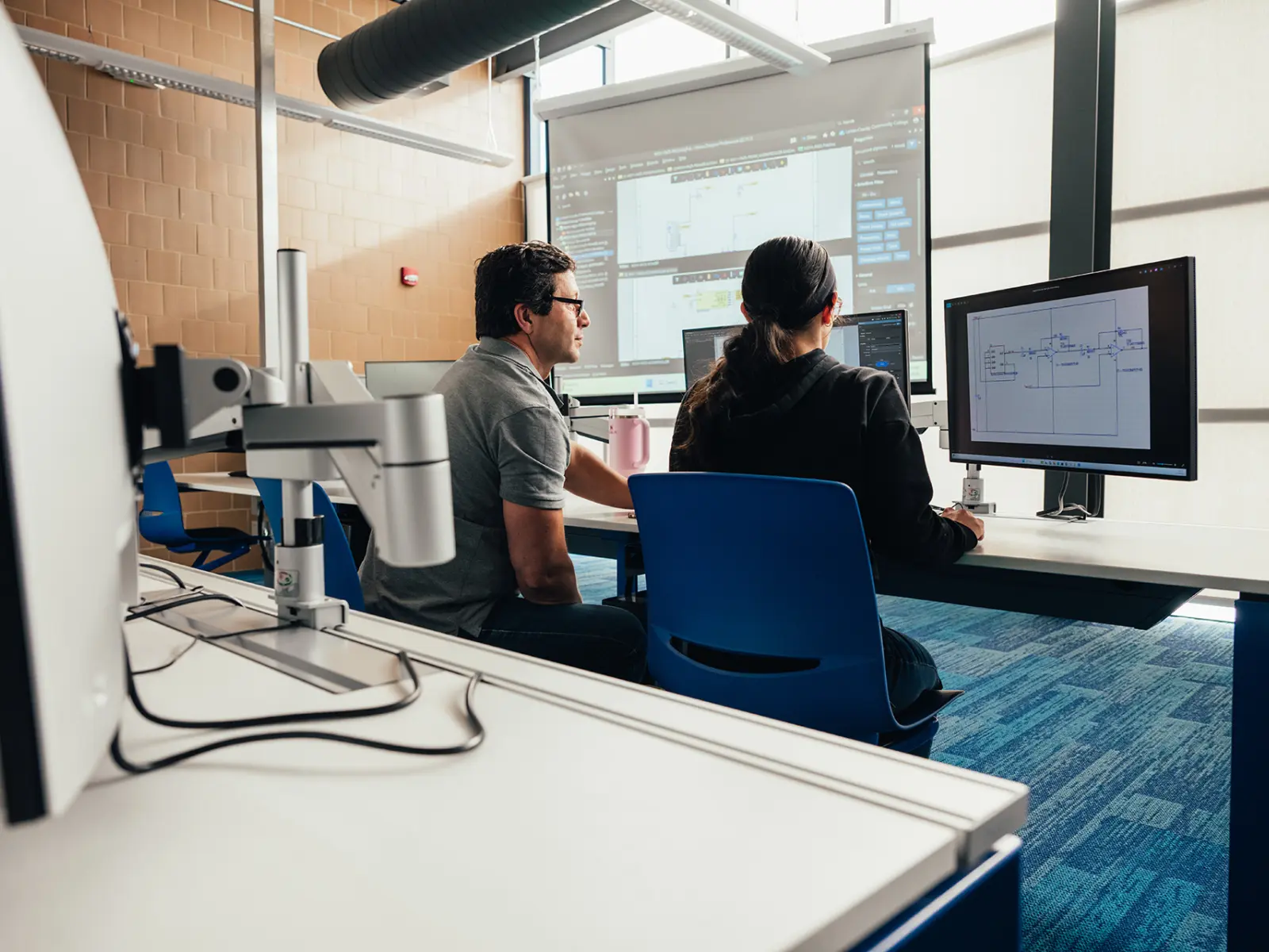
Ohio Students SAIL to Success in Lorain County
A New Commitment to Solving Serious Crimes
Criminal Justice
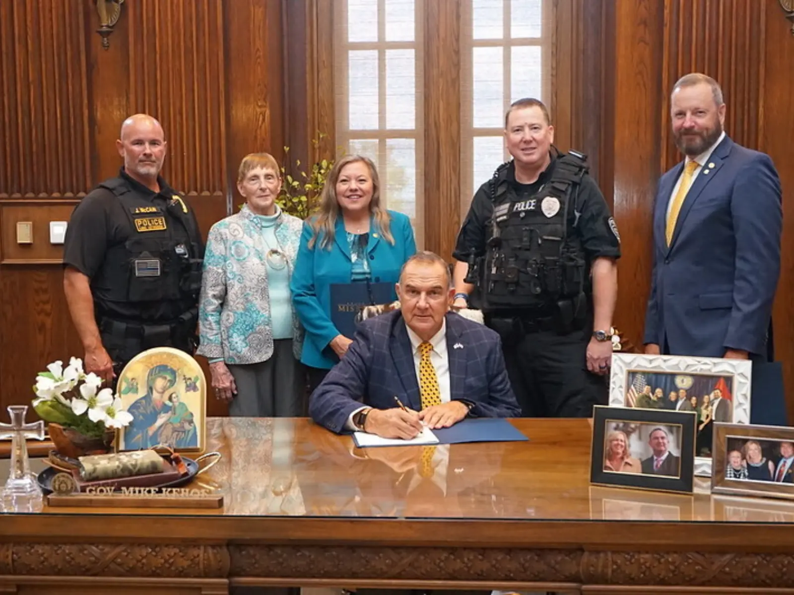
A New Commitment to Solving Serious Crimes
Why We Need to Rethink Transmission: The 3 P’s
Energy

Why We Need to Rethink Transmission: The 3 P’s
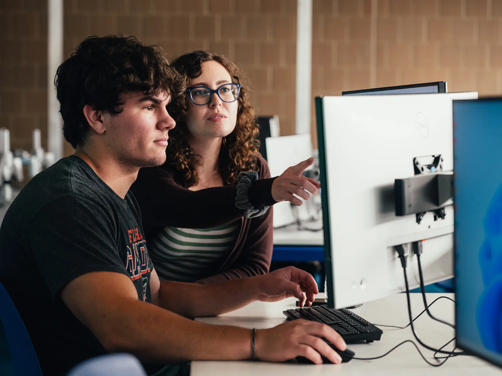
Let’s Fix Our Community College System — ASAP
Higher Education
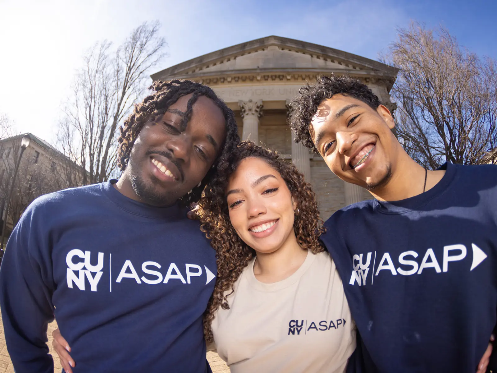
Let’s Fix Our Community College System — ASAP
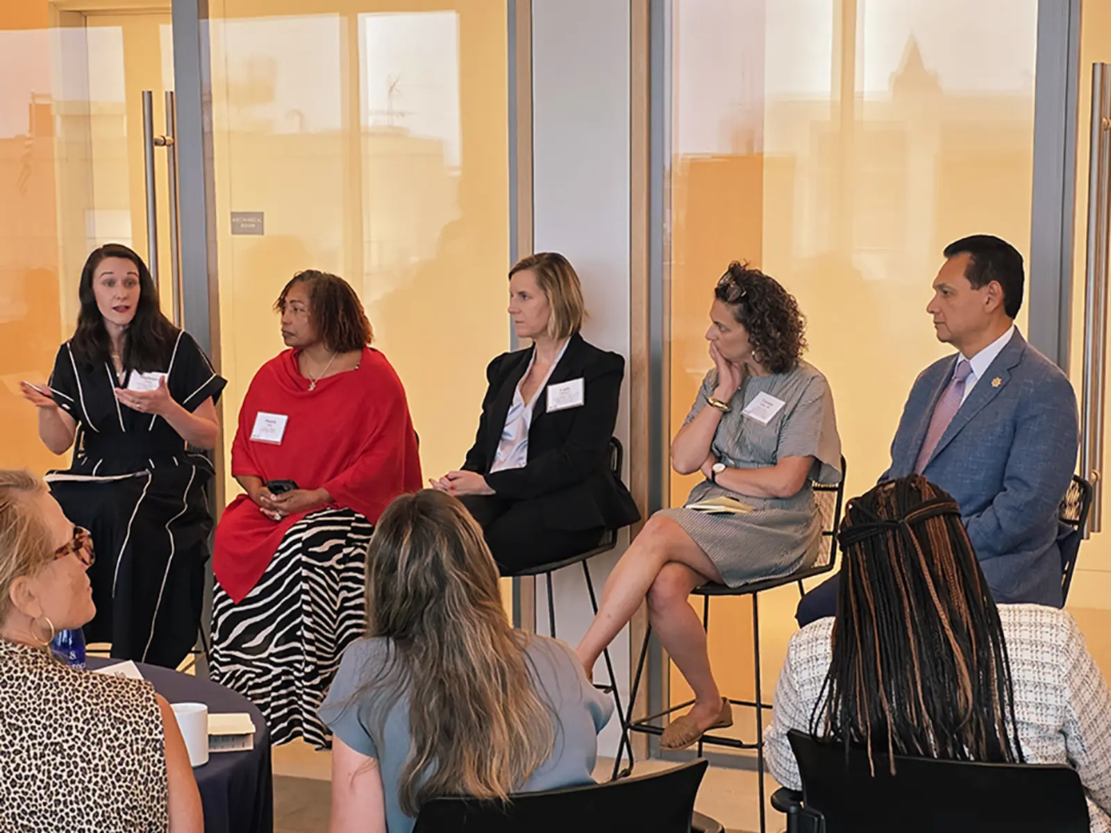
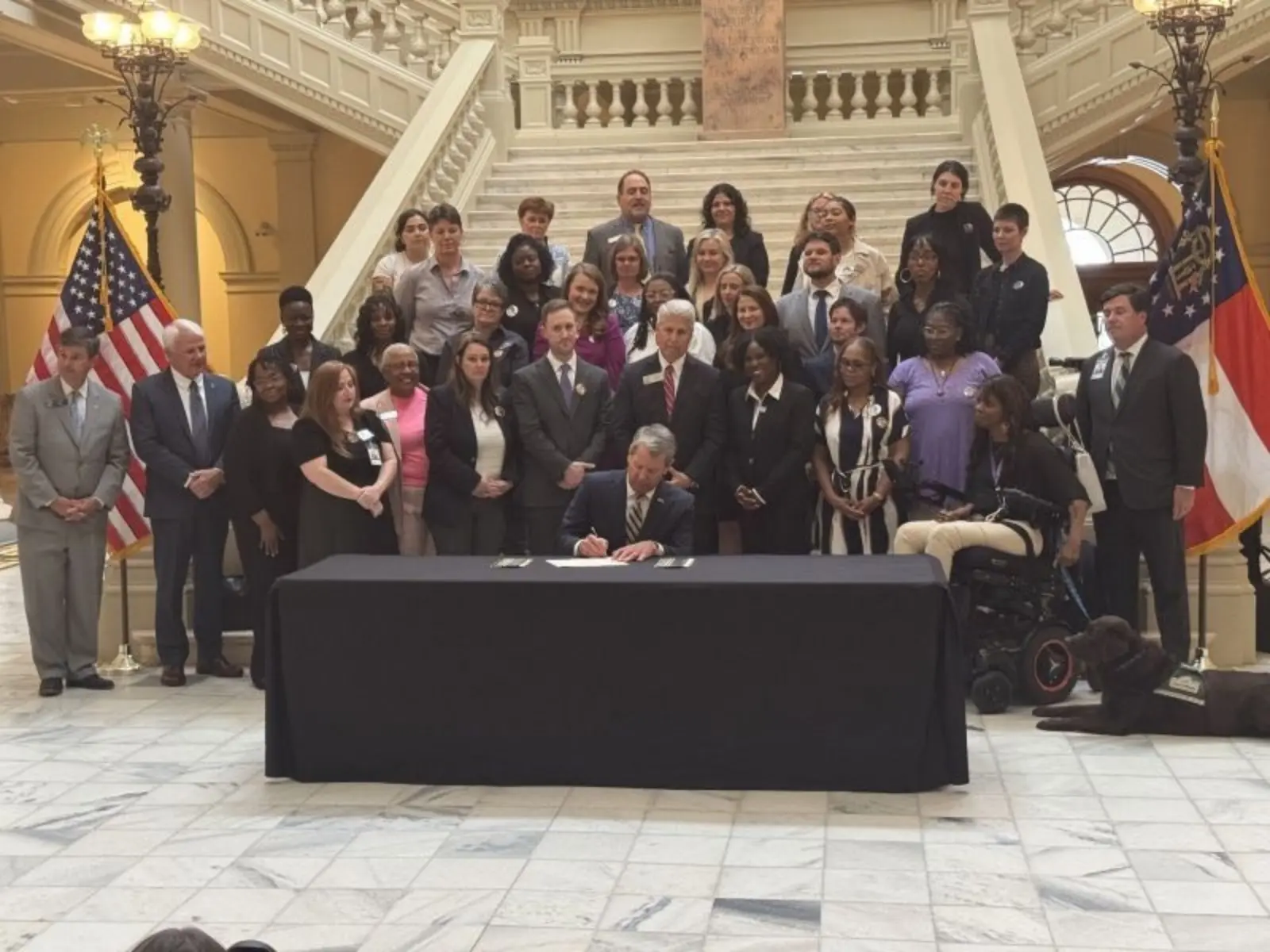
Arnold Ventures Partners with Maryland to Scale Evidence-Based Programs
Partnerships for Proven Programs
Arnold Ventures Partners with Maryland to Scale Evidence-Based Programs
The Pro-Housing Movement Has Momentum, Now We Need Staying Power
Housing

The Pro-Housing Movement Has Momentum, Now We Need Staying Power
The Results Are In: Big Brothers Big Sisters Makes a Real Difference for Mentees and Communities
Evidence & Evaluation
The Results Are In: Big Brothers Big Sisters Makes a Real Difference for Mentees and Communities
The Senate Serves up a Second Helping of Pork
Federal Tax Policy

The Senate Serves up a Second Helping of Pork
Lawmakers Preserve Public Safety While Reducing Long Prison Sentences
Criminal Justice
Lawmakers Preserve Public Safety While Reducing Long Prison Sentences
Opportunity Zones: A Tax Break That Missed Its Target
Federal Tax Policy

Opportunity Zones: A Tax Break That Missed Its Target
Taxing the Investment Income of Foundations Is Consistent With Good Tax Principles, but Fixes to OBBB Plan Are in Order
Federal Tax Policy

Taxing the Investment Income of Foundations Is Consistent With Good Tax Principles, but Fixes to OBBB Plan Are in Order
About Us
We strive to maximize opportunity and minimize injustice by investing in systemic solutions that will outlast our funding.
- Criminal Justice
- Evidence & Evaluation
- Health
- Higher Education & Career Pathways
- Infrastructure
- Public Finance
